Chances are, your favorite team has a fairly silly logo. The vast majority of them are cartoonish in nature, but at least the ones today look good. Computer animation, slick artwork, and fine-tuned quality control churn out logos that may be geared toward children, but at least look good on that ridiculously overpriced Official Team jacket you’re wearing.
This was not always the case though. In the earliest of times, sports logos were simply crudely drawn letters signifying the team: B for Boston, NY for New York, SOS for any team from Cleveland, stuff like that. But then the teams started getting creative and artsy. They shouldn’t have. They really, REALLY shouldn’t have.
10. Boston Celtics, 1950-1968

The Celtics have long been represented by a leprechaun
9. Minnesota Twins, 1961-1969
![]()
Talk about dedication to a name; the logo for the Twins used to actually be freakin’ twin brothers. Well, theoretically anyway. Stare for more than five seconds and you’ll realize the two look nothing alike besides being white; their faces and shape of their heads are completely different from one another. And why do they feel the need to shake hands over the river? It’s the tiniest river of all-time, and either of them could just crush that bridge and step over the water at any time. No need to reach over like it’s a sacred border of some sort.
8. Denver Nuggets, 1974-1976

An old-timey miner happily dancing and clicking his heels because he just unearthed a bee-YOO-ty of a red-and-white basketball. Because they’re the Nuggets, you see. Nuggets of gold? Those shiny things miners typically mine for? Get it? Well, this miner mines for basketballs because the Nuggets are a basketball team, you see. Makes sense to us.
7. Milwaukee Brewers, 1970-1977
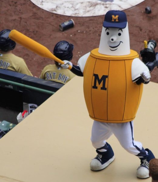
This is the Beer Barrel Man: a product of a simpler time, when a team’s mascot could literally be overflowing with alcohol and nobody would complain. Not surprisingly, he’s a fat-ass with a giant beer-belly. Far more surprisingly, he doesn’t look anything like a beer barrel. With that giant schnozz, he looks like what would’ve happened if Pinocchio continued to lie and never became a real boy.
6. San Diego Padres, 1969-1984

Like with the Twins, this is what happens when a team with a less-than-badass nickname decides to be literal. The Padres spent fifteen years being represented by a cartoon monk swatting a ball. While it was a crowning achievement for all the middle-aged bald guys in the crowd who regularly wear bathrobes and flip-flops all day, it did little to scare the other teams.
5. New York Knicks, 1946-1964

He’s old, he’s fat, his vision sucks, he’s not properly dressed to play, and he apparently can’t hold onto the ball to save his life. Father Knickerbocker everybody! And is that ball the size of a dinner table, or is he just 18 inches tall?
4. Boston (New England) Patriots, 1961-1964

This first incarnation of Pat Patriot wasn’t changed much over the years actually, with one exception. Back in the day, the dude was just plain creepy. His wild eyes, his psychotic sneer, and the fact that you can practically hear him going NYAH-HEEH-HEEH-HEEH-NYAHH-HEEEEEEEEH like an evil dwarf wizard; everything just adds up and reveals a man who either loves hurting his opponent just a little too much, or who wants to take that ball back to the locker room for a little “alone time”.
3. Denver Broncos, 1960-1961
Why is the football player so much bigger than that poor horse? If that isn’t animal cruelty, then we don’t know what is. And why is he picking his teeth while riding a pissed-off, wildly bucking wild animal? Sorry to break it to you, but that flimsy leather helmet of yours will not save you when that horse finally snaps and tosses you to the ground like a gigantic, humongous sack of potatoes.
2. Detroit Tigers, 1927-1928

While this may look like something we puked up in ten seconds via MS Paint as a joke entry, trust us; it’s real. And it’s supposed to be a big scary tiger. Not a house cat eating mayonnaise, not an upset teddy bear, not a ridiculously easy maze from a bad coloring book, or anything else that it actually resembles. If this were an entry in a kids-draw-the-mascot contest, then it’d be fine. But no; a grown man got paid money to create this. And then other grown men approved of it and used it. And the fact that they only used it for a couple years is no comfort. That’s still a couple years too many.
Oh and what the Hell are those blue squiggles for? If those are actually supposed to be stripes, then it somehow manages to look even LESS like a tiger than before.
1. Boston Red Sox, 1950-1959

For ten whole years, this nightmare represented one of the most famous franchises of all time. Yes, that would in fact be a giant, anthropomorphic sock taking a swing at the plate. And a poorly-drawn sock at that; even by the admittedly-low standards of walking, talking cartoon footwear, this was just crap. Virtually all of its joints are missing, meaning if he suffers a broken bat, his arm would likely go flying along with it. Which, come to think of it, is a pretty nifty way to freak out the other team.
Also, the sock has feet, which is kind of like having a conjoined twin (triplet?), only somehow creepier. Hopefully the sock wears little wool people on its feet, because if the sock wore socks, that would just be cruel.
Jason Iannone wrote this; you may applaud him now. He is also the main article editor of TopTenz. Like him on FaceBook, follow him on Twitter, and send him writing offers and oodles of money via [email protected].
15 Comments
I don’t care for the patriots, but I personally like their old logo.
To the author: You’re clearly a cranky person. There are so many awful sports logos today, and many of these are straight up classics. Ripping the good natured Twins? The dancing miner? The Beer Barrel guy and the Swinging Friar are beloved icons of their cities. I understand fair criticism, but this was just shredding for shredding sake.
Take on a more viable set of logos to dismantle, like 90% of minor league sports teams. Most of those were once bore wonderful artwork, but since the digital revolution designers got lazy.
Hey, I know the author and he is not cranky. Just sayin’
I’m no expert but that Boston sock sure looks like the state of Mass too…
@Peter: Actually, that movie was “Predator”.
@ Lou. Thank You for the correction of the movies. I have a theory on movies of that genre, the less dialogue that their is, the better the movie is in my opinion. Like Stallone, Bronson, the macho vigilante movies where they are out to be a vigilant and get their revenge. Thanks Again.
I think you may have to be from the city to love the team logo because I am from Milwaukee and I love the Brewers’ classic logo. That is just my opinion.
That Twins logo is more than two dudes shaking hands over a river. They each represent one of the Twin Cities: Minneapolis and Saint Paul. Or, Minnie and Paul, because yes, they do have names. This is a classis logo that has even been immortalized at Target Field in the form of a massive neon sign that goes crazy after home runs and wins at the park. Check your sources for the meaning behind these kinds of things, because being a lifelong Twins fan, the logo may be ‘old timey’ as you put it, but there sure is a ton of history and pride behind that logo, and (more than likely) the other logos on this list.
@ Cole. I am not a Minnesota fan, but why did it take so long for Bert Blyleven to make it into the Hall Of Fame as I feel he should have been eligible on his 1st year of being inducted. 5th on the all-time strikeout list and 60 shutouts ???!!!. C’mon people at the Hall Of Fame and shame on them. 14 years it took them ? Go on to You Tube and type in Senator Al Franken’s speech that he gave in Congress about why it took so long for Bert to finally make it. Its a great speech. Though I have never been to Minnesota and will someday love to visit. I already love it. What other state can say that they have a former cast member of Saturday Night Live as a United States Senator and having a Professional Wrestler Bad Guy (or a “heel”) Jesse Ventura as governor of your state. A good trivia question is what is the only movie ever made starring two future Governors. The movie “Commando” starring Arnold (California) and Jesse (Minnesota).
To put it simply, Bert didn’t get in right away because of the W-L. His other numbers, SO’s, ERA, shutouts, and complete games are worthy of an instant call from the Hall, but all that the sports writers care about is wins. Many of his years in Minnesota came with microscopic run support. Lots of his losses in MN were 1-0, 3-2, 2-1 kind of losses. No runs= No W. As simple (and as stupid) as that. If you’re a baseball fan, Target Field is like no other. There’s a reason why many consider it the best park in the MLB. It’s very open and intimate at the same time, especially considering its literally wedged between an interstate and downtown Minneapolis. I live in Duluth (college student) but I grew up a half hour west of Minneapolis. When you get a chance, see the whole state. It’s definately worth a trip!
@ Cole. I enjoyed reading your insight on Bert Blyleven. The one aspect of his career record that stands out with me, was the 60 Shutouts that he pitched. That to me is astounding !!! I was born and raised in the Boston Area, so I am a Red Sox fan (getting tickets to get into Fenway Park ? Forget it man, unless you know a person with season tickets or just hunt down a scalper) but I have lived in Arizona now for 4 1/2 years. Jim Rice made it in on his LAST year of eligibility and what I find even more baffling is why Dwight “Dewey” Evans is not in there yet. This Veterans committee should be slapped behind the ears for their decisions. Why is Phil Rizzuto in the Hall Of Fame when he only had 38 career home runs (I would say that its because he was on the Yankees team with Dimaggio, Mantle, Maris, Whitey Ford, Billy Martin, and let’s not forget Casey Stengel as his manager, etc.) Another one is Bill Mazeroski. O.K., he hit the walk-off home run in Game 7 of the 1960 World Series against, again, The Yankees, but what else did he do ? And what really boils me up is that one of the 2012 HOF inductees will be Ron Santo who knew he was dying along with being Diabetic. Well, Ron dies and one year later, and they induct him. That’s a shame. Couldn’t they have inducted him say 2 – 3 years before his death ? And last but not least, Bud Selig MUST BE FIRED. No ands, ifs, or buts about it. So long as he is Commissioner of Baseball, Pete Rose will never be inducted. Here’s a compelling figure for you. Rose ended his career with 4256 hits. If you do the math, that means a player would have to have 21 consecutive seasons of 200 hits with another 56 to spare.So he gambled, I think we all have in our lifetime. Big Deal. But in 1907, The racist Ty Cobb viciously stabbed a Bell-Hop at a hotel that he was staying at. Why ? Because the Bell-Hop was a Black man. And Cobb is in the Hall ???? Please, something ain’t right here. By the way, the Bell-Hop Thankfully survived.
I couldn’t agree more. It’s, unfortunately, a pure numbers game. Take Tony Oliva for example: A spectacular career (.304 avg, 8x All Star, 220 hr,947 RBI) over a 14 year career hampered by nagging injuries. Not to mention a RoY award and countless years as a coach and mentor for the Twins. Brilliant star, but his career ended (and it wasn’t his fault). I think he deserves a call to the Hall, along with other people who put up great numbers (maybe not top 10-20) as well as the players who lived their lives as good people (unlike Ty Cobb). Numbers shouldn’t necessarily mean an entire player’s legacy. But, a few exceptions, like Rose, should be made.
Does the Author of this list have a problem with Boston and Denver teams ? Or is it just a coincidence. The final score of this list is Boston 3, Denver 2
The Twins logo is not supposed to be twins. It represents the Twin Cities. The letters on the two: M for Minneapolis and the STP for St. Paul.
Exactly! And I love that logo! Looks great on the throwback jersey patch! 🙂