Maps reveal the world around us. They also reveal how we see that world and how our interpretation of what we see changes over time. The art of cartography is shaped by the limits of particular landmasses. It is also shaped by the limits of human knowledge, and the limitlessness of human ambition. Below is a list of maps that were startlingly inaccurate, either due to the cartographers’ lack of information or by someone’s deliberate design.
In some cases, these inaccurate maps provide a history of various cultures’ thoughts about geography. In some cases, despite their inaccuracy, these maps have heralded moments of sociocultural change.
“All cultures have always believed that the map they valorize is real and true and objective and transparent,” says Jerry Brotton, a professor of Renaissance Studies at Queen Mary University of London. Sometimes, those cultures are terribly, terribly wrong.
10. Christopher Columbus’ Map of a Sea Trade Route to India
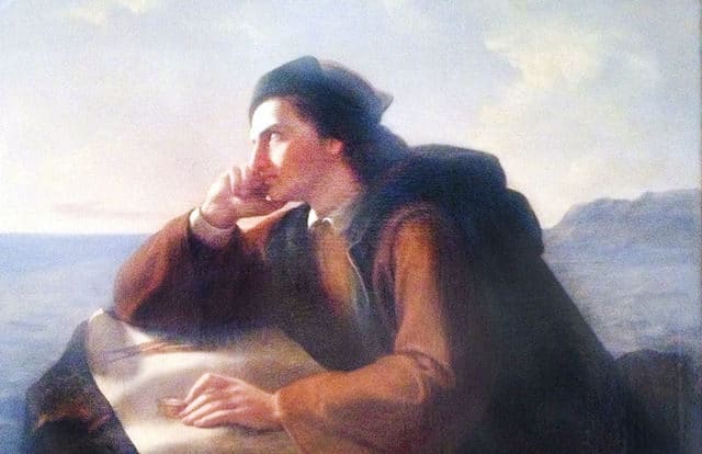
Every American school child learns the rhyme, “In fourteen hundred ninety-two, Columbus sailed the ocean blue.” Sometimes, though, the same school children are given misleading information about how well informed Christopher Columbus was (or wasn’t) about the ocean he was sailing. Unlike members of the contemporary Flat Earth Society, the Genovese sailor (like most 15th century sailors) was sure the Earth was round. (The myth that Columbus proved the Earth wasn’t flat was perpetuated by nineteenth century writers, Washington Irving and Antoine-Jean Letronne, who wanted to lionize the man in their biographies.) He just wasn’t sure of the circumference of the globe.
Florentine physician Paolo del Pozzo Toscanelli suggested in his correspondence with Columbus that China was 5,000 miles west of Portugal. Based on Toscanelli’s calculation, Columbus (wrongly) determined that Japan was 3,000 miles west of the Canary Islands, only a quarter of the actual distance. When he landed, he believed Haiti was Japan and Cuba was China. He called the natives he met “Indians,” because he believed he had reached India. Based on his reading of his own map, Columbus never believed he had reached a new land.
9. Apple Maps’ Diaoyu/Senkaku Islands
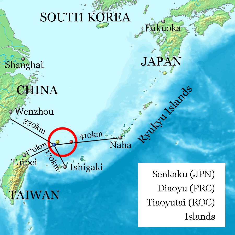
In 2012, Apple ended its partnership with Google. Specifically, Apple iPhone users were previously using Google Maps when they searched for unfamiliar locations. The iPhone 5 was the first to use Apple Maps instead of Google Maps. Mistakes on a digital map can affect consumers worldwide. When Apple released Apple Maps, it portrayed several areas incorrectly. Apple Maps missed capital cities, shifted towns and, in one case, created a new airport.
Most notably, it settled a territory dispute. There is an island chain in the East China Sea that’s controlled by Japan and claimed by China. The Japanese call the island chain Senkaku; the Chinese call it Diaoyu. When iPhone 5 users pulled up Apple maps, they found two island chains, one for each country. One Japanese blogger asked, “Is this a message from Apple that we civilians must not get engaged in a pointless dispute?”
8. The Little Man In The Map’s Oddly Shaped Hat
https://www.youtube.com/watch?v=hEhpJuFdUdo
American school children are often taught to identify Minnesota, Iowa, Missouri, Arkansas, and Louisiana by looking for “The Little Man In The Map.” Minnesota forms the man’s oddly shaped hat. Iowa forms his face. Missouri and Arkansas, respectively, form his coat and his pants. Louisiana forms his boots. Included in the man’s hat (Minnesota) is the Northwest Angle of Lake of the Woods, Minnesota, the northernmost point in the contiguous United States. The reason The Little Man In The Map’s hat is so oddly shaped is because the first cartographer to draw the territory that later became Minnesota had never actually seen the land.
Botanist John Mitchell first drew the territory in 1755, when he was commissioned to draw a map demarcating British and French territories. Since Mitchell, who wasn’t a professional cartographer, had never visited the area, he based his drawing on the accounts of governors and explorers who had visited. As a result, Mitchell’s representation of Lake of the Woods was rounder and smaller than the area itself. This caused difficulty during post-Revolutionary War treaty negotiations. The British and the Americans wanted to use Lake of the Woods as their northern borderline. Unfortunately, the northernmost point of the lake wasn’t as clearly demarcated as Mitchell’s map led officials to believe. Minnesota still has an awkward nub of land on the northwestern point of the lake since the Americans originally refused to give up that land, which was granted to them in the treaty. Mitchell’s representation of Minnesota wasn’t officially corrected until 1820.
7. Benjamin Morrell’s Islands
Benjamin Morrell was an American seal boat captain and explorer. In his 1832 book A Narrative of Four Voyages, Morrell claimed to have discovered several islands in the choppy waters of the Weddell Sea, including New South Greenland, near Antarctica, and Byers Island and Morrell Island, northwest of Hawaii.
These islands were included on maps throughout the 19th century. As it turns out, however, Morrell was a fraud. In the 20th century, explorers proved Morrell’s islands didn’t exist. In 1910, the International Date Line was redrawn on all maps, as it had previously diverted around two of Morrell’s nonexistent islands.
6. Gerardus Mercator’s Africa v. The Peters Projection
Flemish cartographer Gerardus Mercator’s 1569 map was an ideal navigational tool for sailors. The meridians and parallels were drawn as straight lines that cross at right angles, making navigation simpler. Mercator also prioritized the lands that would be most important to 16th century European sailors. Since he originally made globes, Mercator struggled with creating the correct dimensions for a map. He stretched the northern and southern extremities in order to fill out the gaps when he flattened his globe. This distortion makes Mercator’s map, which is still used in most schools, one where Africa appears smaller than Canada, Russia, the United States, and Europe.
While Mercator’s choice was pragmatic, it has sociopolitical and sociocultural implications. On the map, a continent where people of color comprise the majority of the population is dwarfed by countries with predominantly white populations, even though Africa is bigger than all of them. To counter this narrative, public schools in Boston, Massachusetts have advocated that the 1973 Peters Projection, where landmasses are presented as their actual size, should also be used as a teaching tool.
5. The Sun Newspaper’s Map of the Middle East
:no_upscale()/cdn.vox-cdn.com/uploads/chorus_asset/file/18415799/twitter.jpg)
Many of the countries in the Middle East were not naturally formed by people who shared a national identity and a set of sociopolitical and sociocultural values. (The name the Middle East is itself Eurocentric, as it divides the globe using the perspective of a European taking a trade route to Asia.) Instead of forming naturally, the countries of the Middle East were formed by Europeans making trade agreements that benefited their own countries. In 1916, the Sykes-Picot agreement created the countries of Syria, Iraq, Lebanon, and Palestine as British and French protectorates. When the Allies divided and claimed the territories of the Ottoman Empire after World War I, they restructured former fiefdoms into nations. The 15 million residents of the Ottoman Empire had been subjects, not citizens. People who were now living in close proximity didn’t necessarily share a national identity.
Actual European intervention has created geopolitical, sociopolitical, and sociocultural tensions in the Middle East. The British tabloid The Sun, however, changed the geography of the Middle East simply by printing a faulty map. On this map, Syria had annexed Kurdistan, while Iraq had annexed Israel, the Palestinian territories, Jordan, and parts of Syria and Lebanon.
4. The Soviet Union’s Cold War Maps
Before the Soviet Union collapsed in 1991, Soviet leader Mikhail Gorbachev admitted the country had declared accurate maps classified information since Josef Stalin’s rise to power in 1922. On the orders of the Committee for State Security (the English translation for the name of the Russian secret police; you know it better as the KGB), cartographers relocated rivers and lakes, blurred boundaries, and removed landmarks — such as KGB headquarters — on all public maps.
Gorbachev ordered the release of accurate maps in 1988, as part of an effort to show the international community that the Soviet Union was committed to transparency. Before the waning of the Cold War, the most accurate maps of the Soviet Union belonged to America’s Central Intelligence Agency.
3. Nicaragua Expands Its Boundaries Using Google Maps
In 2010, Edén Atanacio Pastora Gómez, who was then Nicaragua’s Minister of Development of the Río San Juan Basin, invaded Isla Calero, a nearly two mile island that has protected environmental status (because it’s a wetland ecological reserve). Pastora’s act was an invasion, because the wetlands belong to Costa Rica. Pastora knew that; a Costa Rican flag was planted on the land, and Pastora replaced it with a Nicaraguan flag. When Costa Rica’s government formally complained to Nicaragua’s government, saying Pastora could not claim the land for his country, Nicaragua’s president, José Daniel Ortega Saavedra, had a prompt answer: Pastora didn’t need to claim the island, because it already belonged to Nicaragua.
Saavedra said his claim was verified by an impartial authority, Google Maps. That year, Google Maps had accidentally placed the Nicaraguan boundary one-and-a-half miles into Costa Rica. Saavedra said that, based on the boundary lines drawn by Google Maps, Isla Calero was Nicaraguan territory. Both countries sent troops to the island. Google Maps publicly refuted Saavedra’s claim. In 2015, the International Court of Justice ruled in Costa Rica’s favor. In 2016, the Court agreed with Costa Rica’s claim that Nicaragua should pay Costa Rica $6 million in damages. Unfortunately, the Court has no powers of enforcement. In 2018, Nicaragua paid $378,890 to Costa Rica. Costa Rica accepted the sum, and the compromise.
2. The Hunt-Lenox Globe
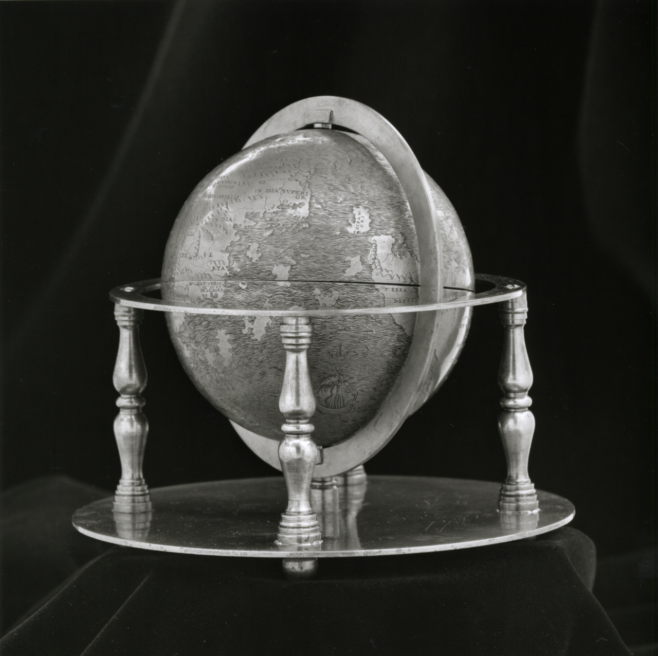
The phrase “Here there be monsters” is ubiquitous in pop culture. It is the name of an Apple podcast, a short film, and a series of mods in the highly acclaimed video game The Elder Scrolls V: Skyrim. The story (or myth) behind the phrase is that 16th century cartographers wrote “Here there be monsters” over unknown territory.
Enduring as the phrase has become, the myth isn’t accurate. Actually, the phrase written over unknown territory was “Here there be dragons,” and it only appeared on one globe. The Hunt-Lenox globe, which is currently kept in the Rare Books division of the New York Public Library, is a five inch, engraved copper globe that was designed circa 1510. HC SVNT DRACONES is an abbreviation for the Latin phrase “Hic Sunt Dracones” (“Here are dragons”). The warning is engraved across the southeast coast of Asia. There are etchings of ships and sea monsters on the globe, but no dragons have been found in any uncharted territories… yet.
1. The Mountains of Kong
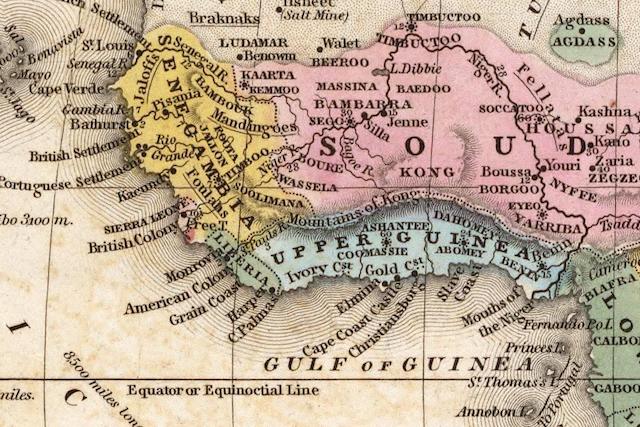
From 1798 until 1891, any map of West Africa would have included an East-West mountain range stretching from the Gulf of Guinea to the Niger River. Any explorers who crossed the Mountains of Kong marveled at the lofty, barren, snowy mountain tops. The mountain range was anywhere from 2,500 to 14,000 feet tall. The mountains were either blue granite peaks or blue limestone terraces. They transfixed anyone who saw them… except no one ever did.
Scottish explorer Mungo Park claimed he discovered the mountain range in 1798. Afterward, many explorers claimed to have found the Mountains of Kong and even crossed them. When French explorer Louis-Gustave Binger surveyed the Niger River between 1887 and 1889, he officially declared the Mountains of Kong nonexistent. By 1891, they no longer appeared on world maps.