Our mental image of world geography is derived from many subjective factors, like where we grow up and our political beliefs. Still, that image turns out to be very similar for most of us, as modern maps are largely uniform around the world.
That’s also exactly why it’s almost always wrong, as the maps we use to find our way around Earth are — almost entirely — wrong. We can’t say that all of them were intentionally made that way, as cartography requires some level of simplification in order to map out all the edges and curves of our planet, though some were definitely influenced by the prevailing views of the time. All of them, though, could end up changing how you imagine these places.
8. More People Live Inside This Tiny Circle Than Outside
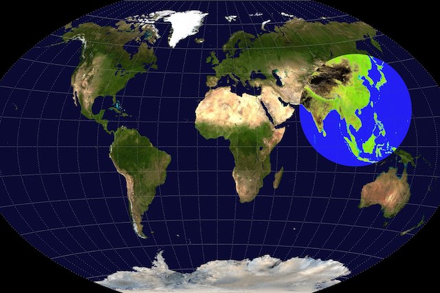
The world has over 7.5 billion people now, which doesn’t seem like a big deal looking at how big the planet really is. Vast swathes of land — like most of Australia and Russia — still lie uninhabited, either due to political conflicts, inhospitable climate or simply not being very nice places to live. So, where are all the people?
The answer is as you’d expect; ‘somewhere in Asia’. Consider this: more than half the world’s population would fit in an imaginary circle (known as the Valeriepieris circle) in the southeast of Asia — as well as some of Oceania — with a diameter of around 5,000 miles. It’s not a surprise, as this relatively tiny circle houses the densely and highly-populated countries of China, India, Indonesia, Japan, Pakistan and Bangladesh, with a total population of over four billion people!
7. Brazil Is Larger Than The Whole Contiguous US
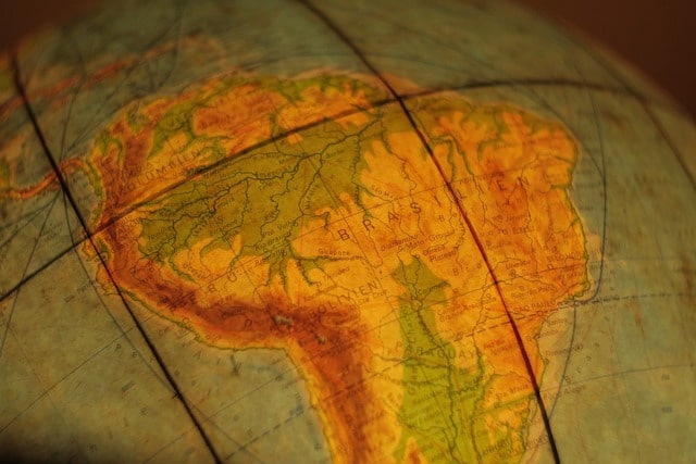
When we think of Brazil, we don’t imagine it as a small country, though we might not imagine it as a particularly large country either. It comes across to be as big as a large state in the USA, and not — say — the fifth largest country in the world.
If you take a look at the South American map, you’d see that it’s not just true, but Brazil is very clearly bigger than most countries we know of. It’s considerably larger than the entire contiguous USA, and is almost as big as the whole continent of Europe!
The reason we don’t imagine it to be particularly huge is because of the Amazon. Around 60% of the world’s largest rainforest lies inside Brazilian territory, almost all of which is still sparsely populated and undeveloped due to the accessibility of the terrain.
6. The Mercator Projection
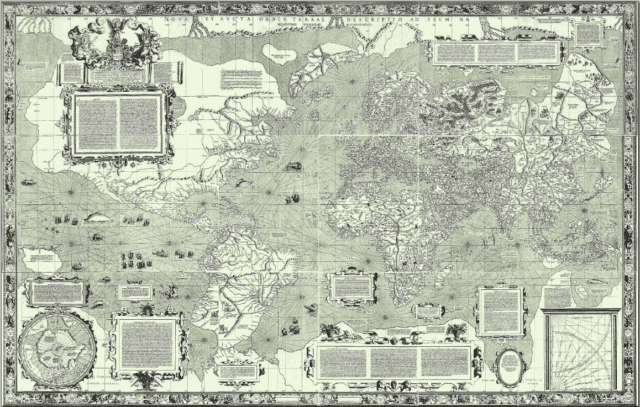
Just take a look at the map of the world, and you’ll see some seemingly glaring inaccuracies. Take Greenland, which looks to be almost as big as Africa. Anyone who knows the first thing about both of those places can say that it can’t be true, and it isn’t. Go over to Africa, and you’ll see that it’s bigger than the United States, India, China, and Brazil – combined. Africa is around 14 times larger than Greenland, yet looks to be around the same size, give or take, on our current maps.
The reason for that — along with many other inaccuracies — is that our current map uses the Mercator projection of the world map, which is only one of the many projections we have. It was first published in 1569, and maps the world taking a cylindrical approach, instead of directly translating a sphere to a circle. It’s not as easy as it sounds, and it was actually a good way to do it, except that it ends up distorting the shape and size of many countries around the world. Europe is also unrealistically bigger in the Mercator projection than it is in reality, though that is in line with the largely Eurocentric view of the cartographers back when the map was first made.
5. Asia And Europe Are Actually The Same Continent
Even if most people know that Europe and Asia are different continents, they wouldn’t be able to tell you why that is. Unlike obviously different landmasses like North and South America, Europe and Asia don’t seem to have any natural border at all. There’s no immediate difference in climate, terrain, types of rocks or really anything else on the right and left side of the Europe/Asia border. The Urals could be a working natural border, though if applicable, many countries — like Georgia — would fall in Asia. There’s also the problem of Russia, as its territories have wildly changed throughout its history, with no clear demarcation between its European and Asian sides.
For all intents and purposes, Asia and Europe are the same continent, and the difference only lies in the geopolitics of geography. Both Asia and Europe were defined by Greek cartographers according to the political status quo at the time, and the border has little to do with cultural or natural borders. It eventually got adopted by other European and Asian kingdoms as it is, giving way to the strict Europe and Asia border we have today.
4. Texas Is On The Same Latitude As Bhutan
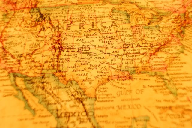
One of the biggest problems with the Mercator projection is that it makes the northernmost countries look much bigger than they are, and as we mentioned before, that comes with a bunch of complications. One of them is our gross misjudgment of how far north Europe and the USA are with respect to each other. Surprisingly, the latitudinal counterpart of New York City isn’t London at all, but Azerbaijan. It becomes even clearer when you compare the southern states of the country. Texas, for example, is on about the same latitude as Bhutan, which is a South Asian country.
The reason we believe this, and still don’t feel like anything is off in our perception, is the weirdly warm temperature of Europe despite its proximity to the Arctic. That’s because of the warm waters from the Gulf of Mexico that flow all the way to Europe, giving it its longer summers and ‘Mediterranean’ climate.
3. Two-Thirds Of Africa Is Above The Equator

Here’s a question: is the Equator above, below, or somewhere around the top in Africa? Most people would probably go with ‘somewhere around the top’, because that sounds about right. After all, the Equator is what separates Europe from Africa for most of us, culturally as well as geographically.
See an accurate map, though, and you’ll realize how inaccurate that perception really is. While the Equator does pass through Africa, it’s much lower than we’re imagining it. It actually cuts Africa almost in two equals halves, except the continent is way bigger towards the top because of how Africa is shaped. Africa is also way more towards the north than South America.
2. The British Empire Was Almost As Big As The Moon
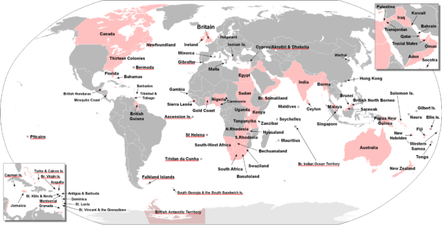
If we talk about the biggest empires in history, something like the Mongol Empire — or even Alexander the Great’s — comes to mind. While they were definitely high on the ranks, by far the biggest empire was that of the British, and we simply have no human perspective for how big it really was.
If it’s not clear by the overwhelming usage of the English language and British technologies around the world, consider that at its peak, the British Empire was also colloquially known as the ‘The Empire on which the sun never sets’, as it was always daytime in at least one of the numerous British colonies. It was almost as big as the entire surface area of the moon, and about twice as big as Pluto.
1. New York Is On The Same Longitude As Bogota, Colombia
When we think of both of the American continents — yes, that’s North and South — we typically imagine them to be vertically aligned, with some differences here and there. We think of the east side of the USA to be on about the same longitude as the east side of South America. That’s why it comes as a surprise to most people that South America is almost entirely east of the USA. In fact, Africa may be closer to South America than many places in America.
The reason the maps don’t account for this is — again — the Mercator projection. South America is shown to be almost comparable to the United States, even if it’s way larger. The longitudinal counterpart of, say, New York isn’t somewhere in Brazil as you’d imagine, but Bogota in Colombia. Even Lima, one of the westernmost cities in the continent, falls on the same longitude as some places in New York state. As you can guess, that means almost the entire United States is west of South America.